Arvo Coffee Co.
A roaster with third-wave craft and first-wave warmth, rebuilt from the mark up.
Arvo roasts serious coffee for unserious hours — the 7am commute, the 3pm slump, the Sunday that starts at eleven. Their old identity said none of that: a stock serif, a brown palette, packaging that whispered when the product deserved a hum.
The brief, in their words: make the shelf feel like the first sip. Warmth you can recognise from across a supermarket aisle, craft you can feel at arm's length.
A mark that wakes up
The new wordmark starts sleepy — soft terminals, low contrast — and sharpens through the weights. The identity literally caffeinates.
Colour on a dimmer
One bone ground, one roast-brown, and a single dawn-orange that only appears where the coffee does. Restraint reads as confidence at shelf distance.
Photography with hands in it
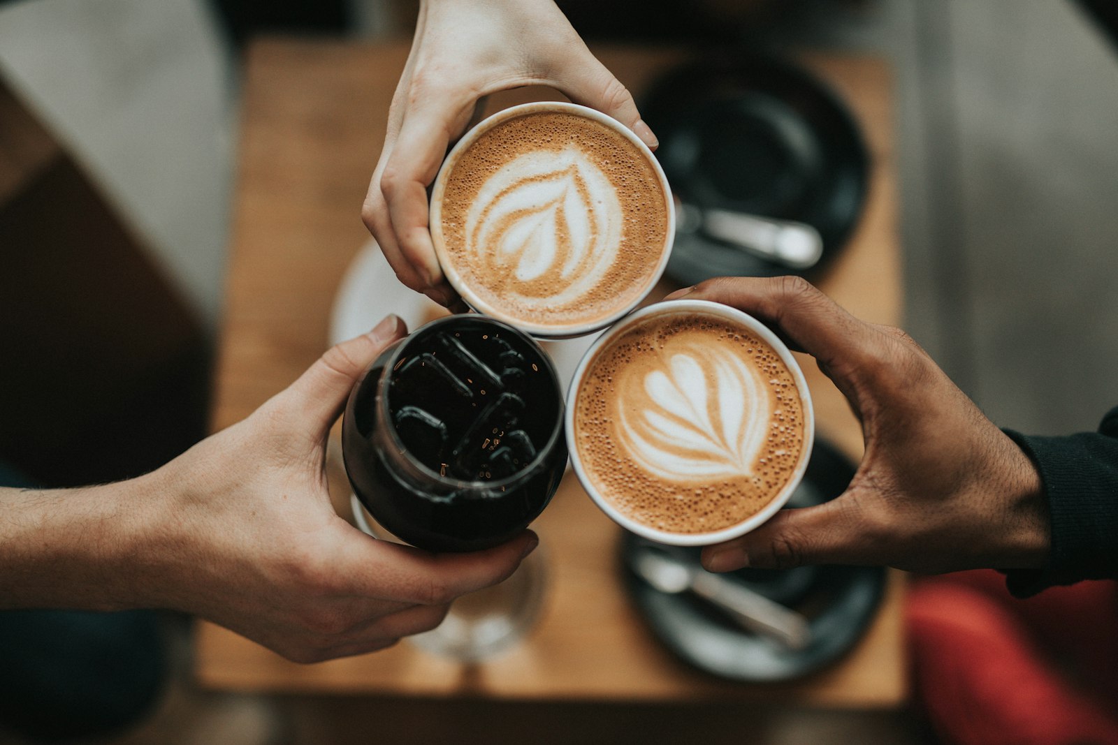
No latte-art hero shots. People mid-toast, mid-laugh, mid-Monday — the warmth is the subject, the cup is the prop.
Six months after the relaunch, the numbers had woken up too.
They didn’t redesign our brand. They taught it to move — and sales moved with it.